Mo2

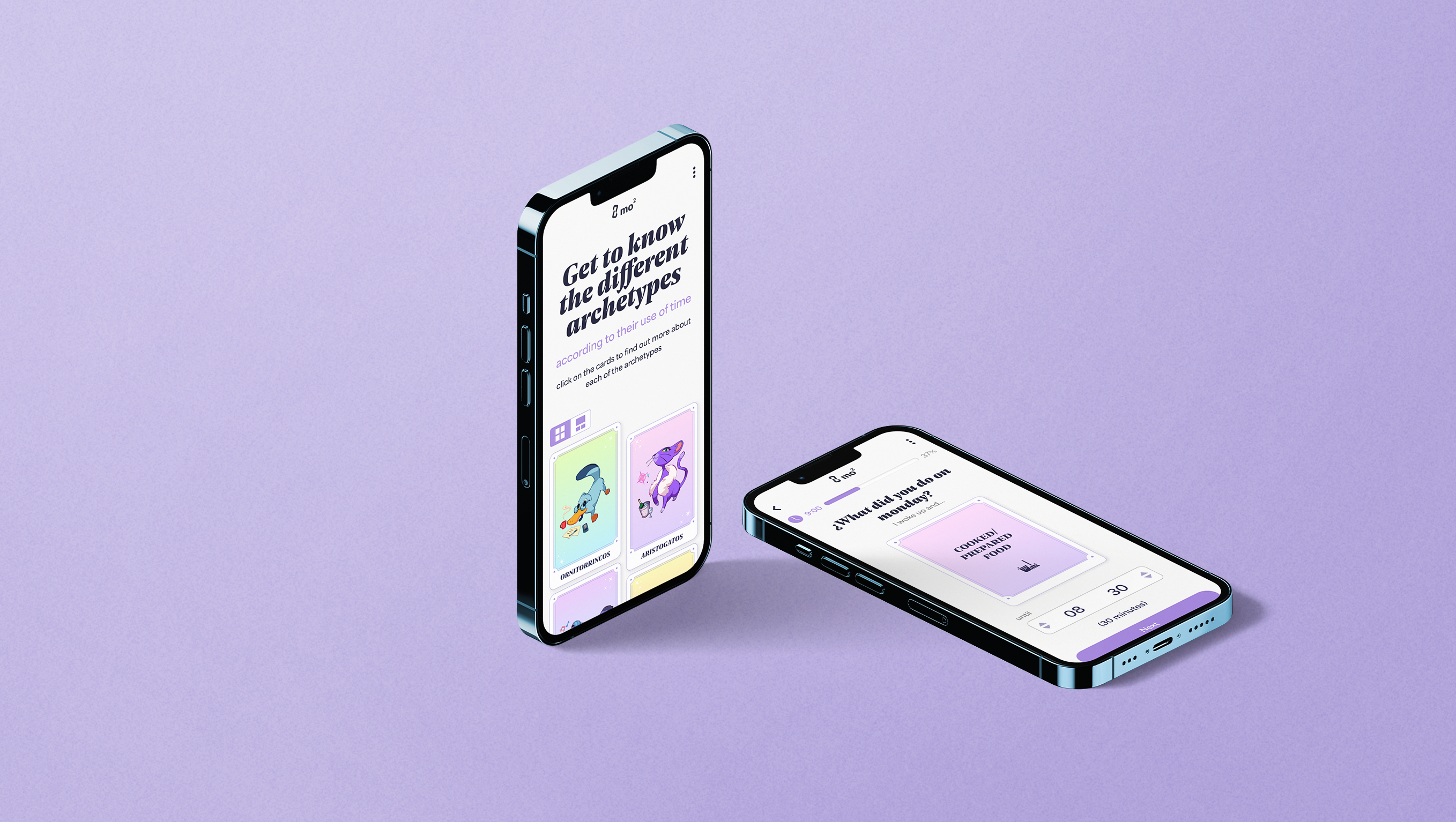
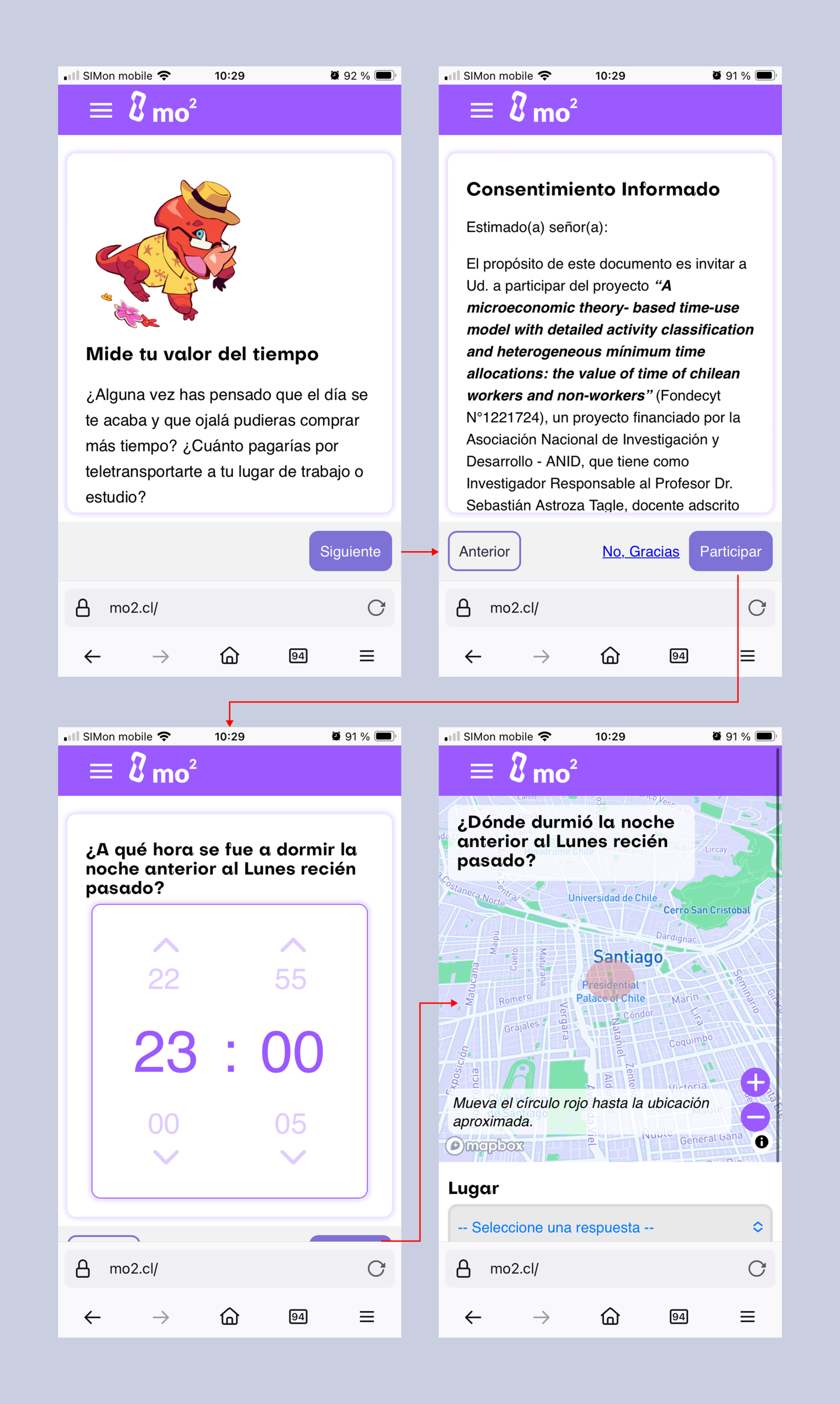
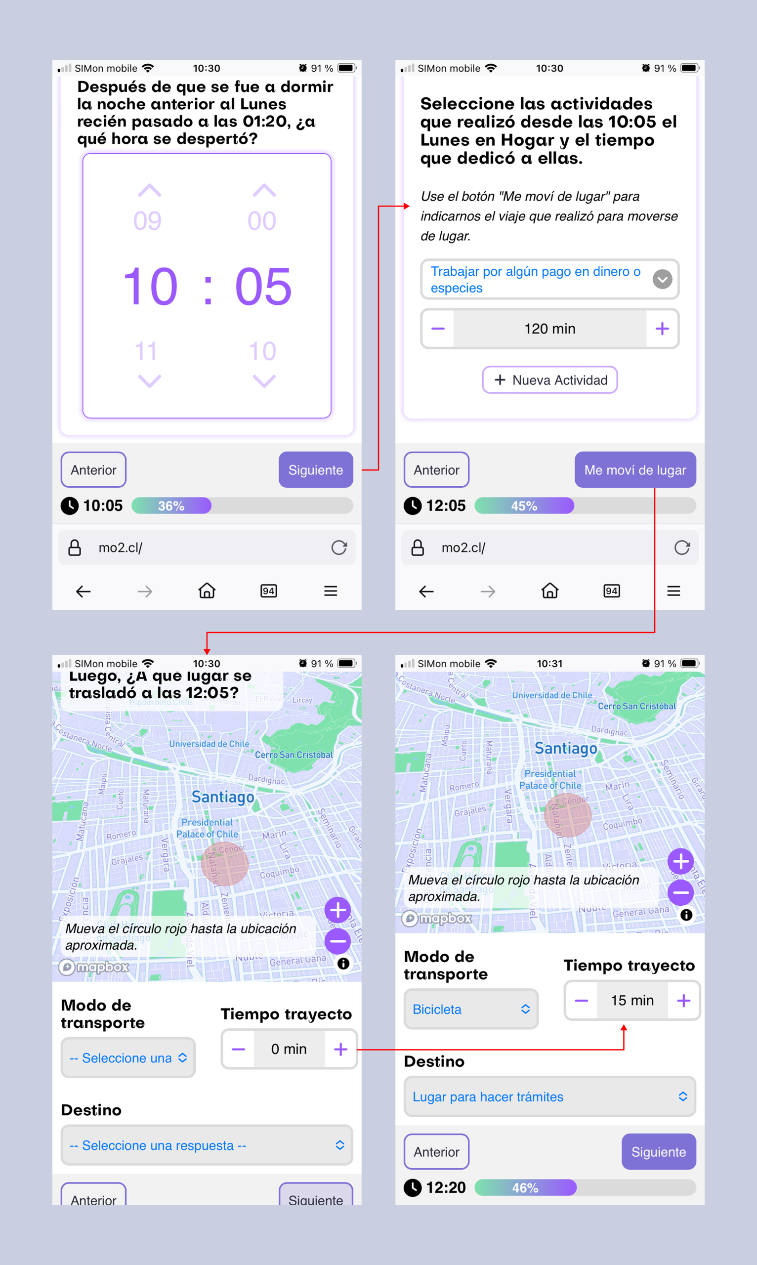
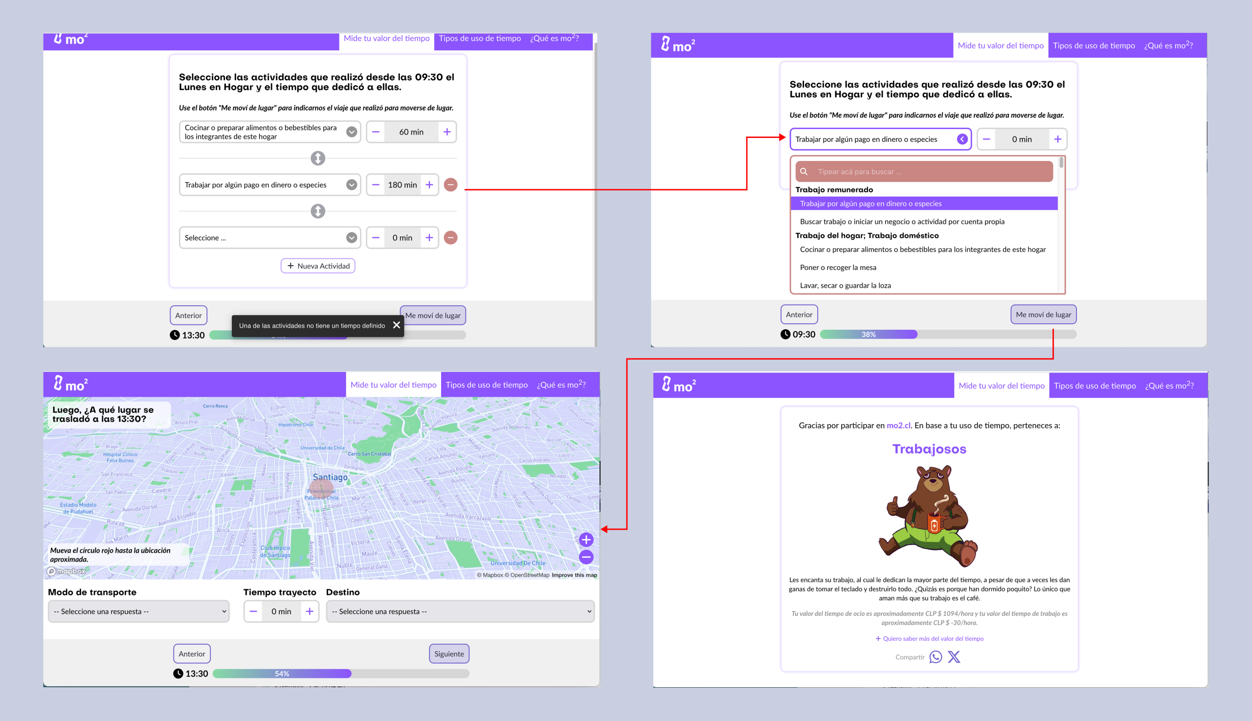
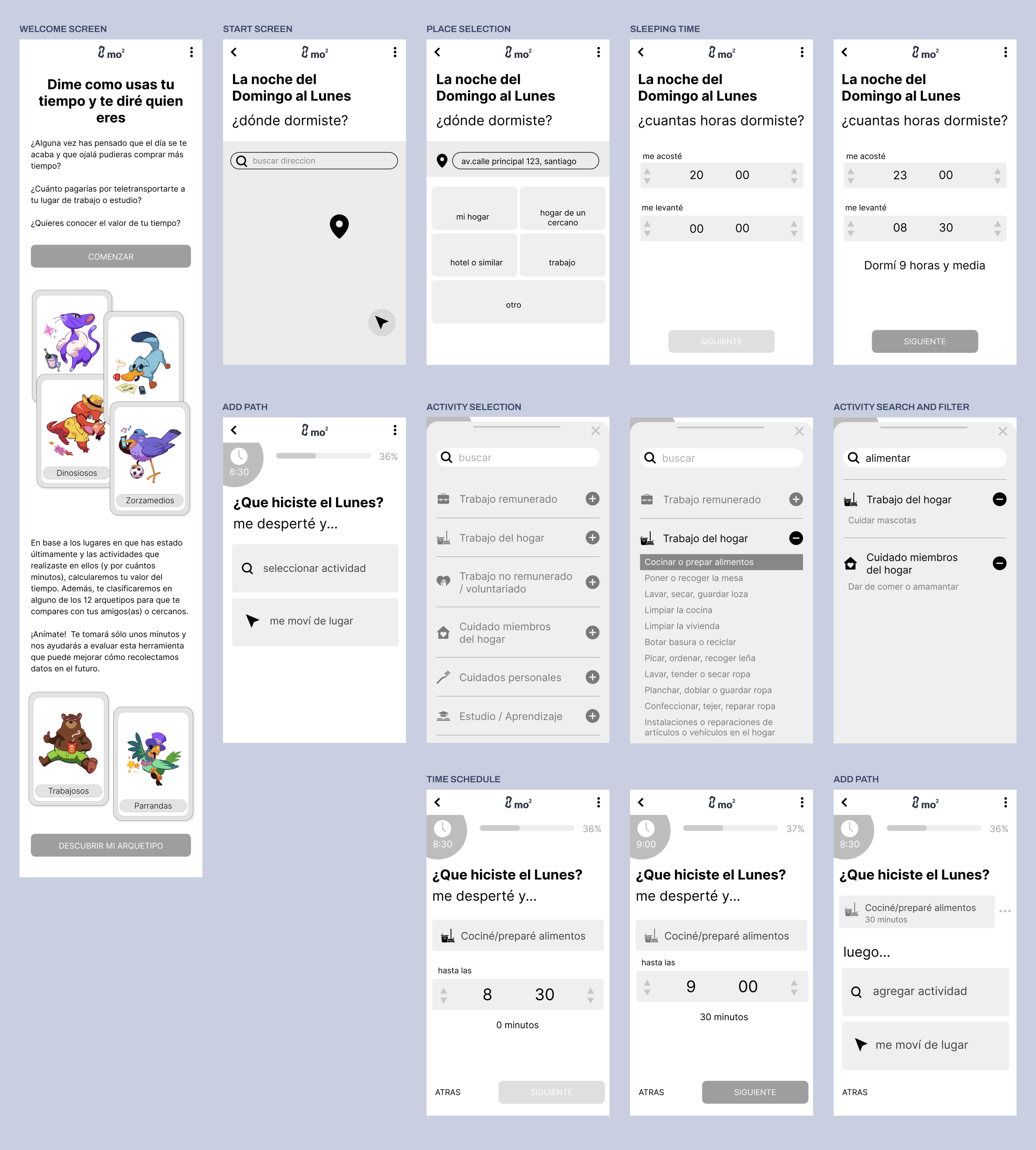
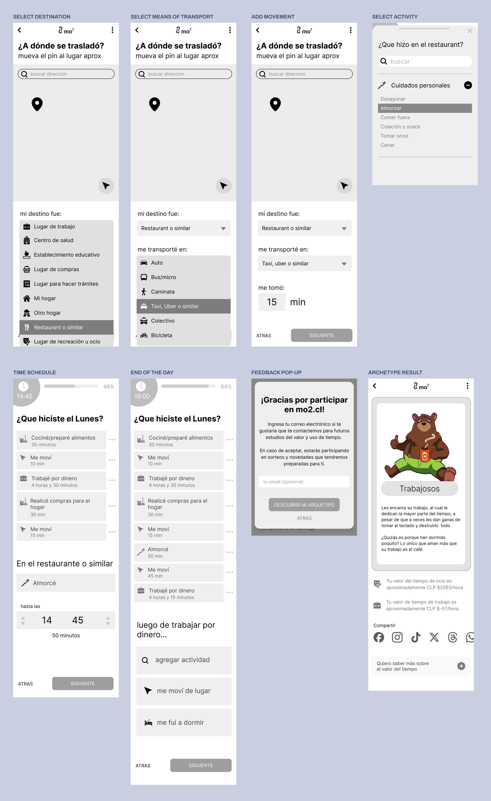
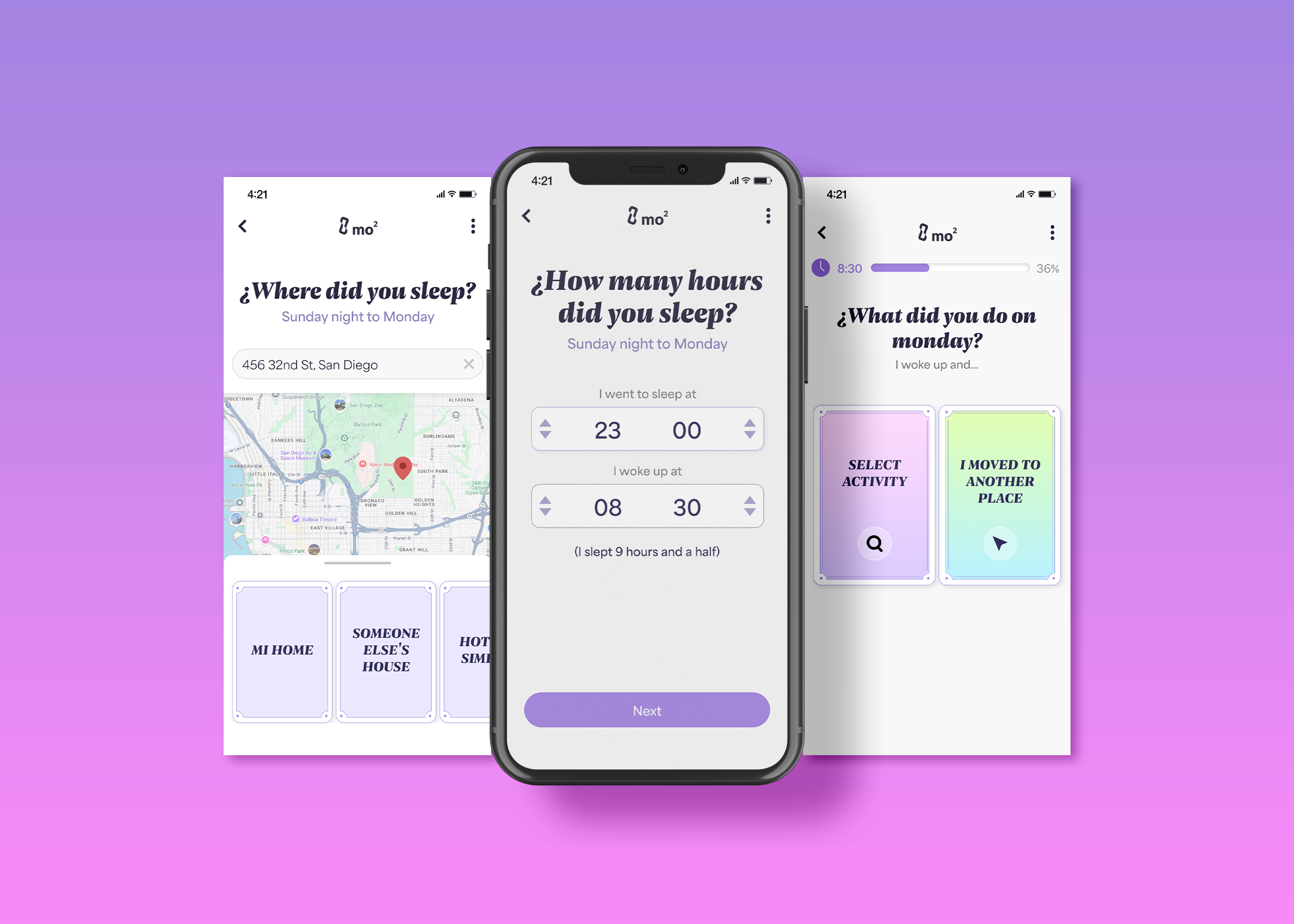
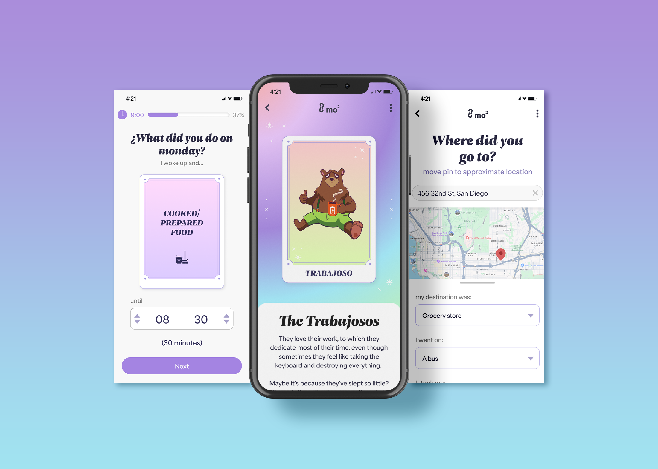
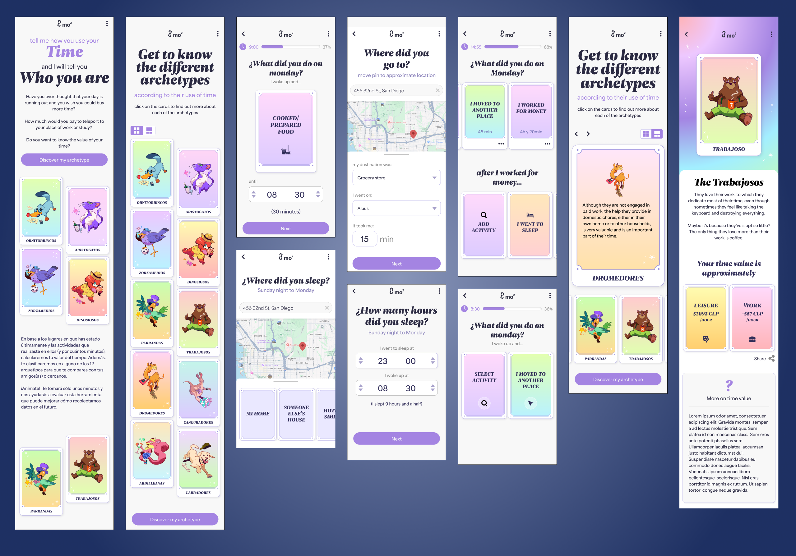
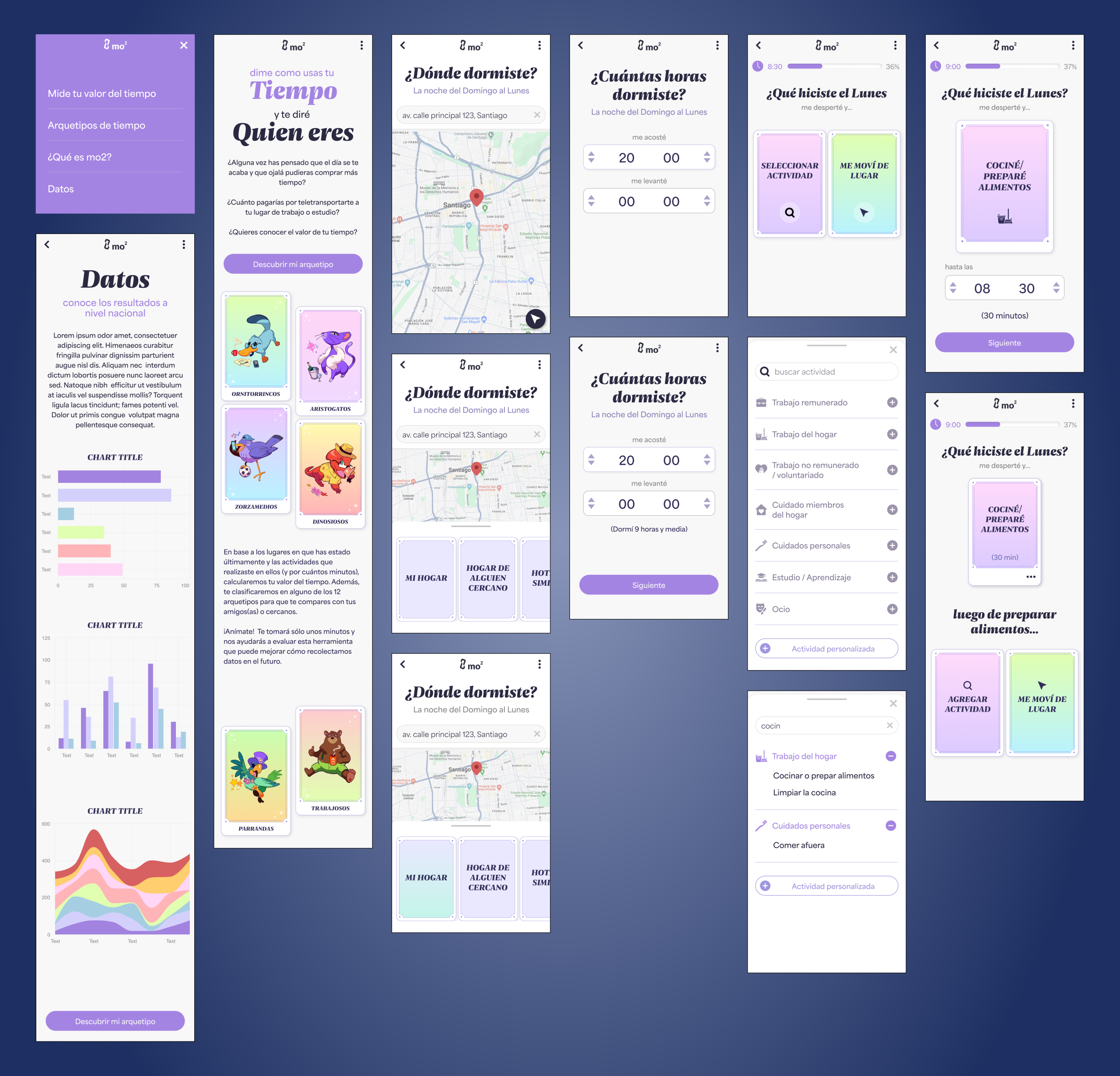
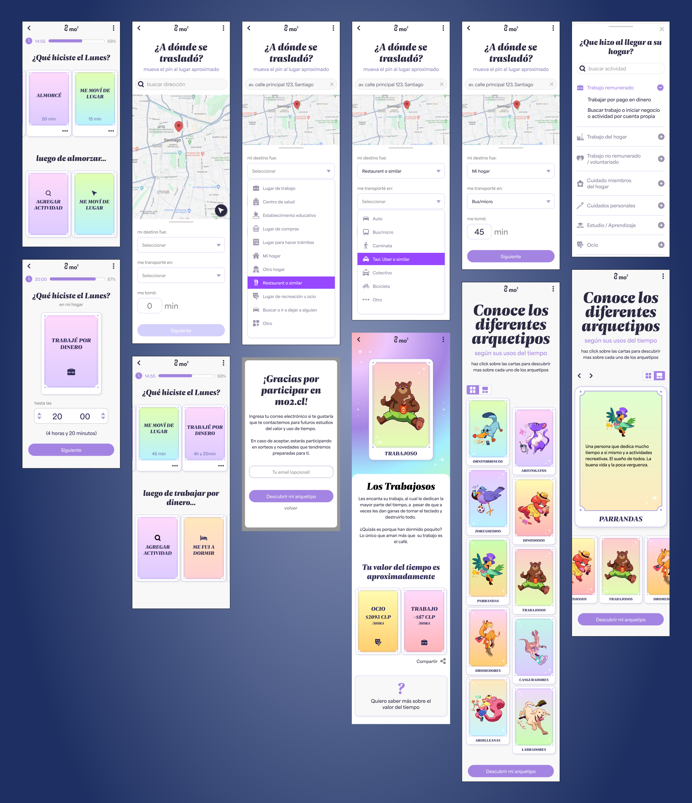
Mo2 is a web platform developed by a research group at the Universidad de Concepción, backed by the Chilean government, to collect time-use data through a more engaging, digital-first approach. The goal was to replace traditional travel and activity surveys with a gamified tool that users would actually enjoy completing — while still delivering accurate data for research and policy.

I joined the team to improve usability, engagement, and completion rates based on platform analytics, user testing, and experience design principles.

The challenge

Early prototypes showed high drop-off rates and user confusion. Despite the innovation in approach, the platform struggled with:

  1. Overloaded screens and unclear question flows
  2. Difficulty in finding expected activities
  3. Low survey completion rates (only 42% of users finished)
  4. Cognitive overload, especially on text-heavy screens
  5. A lack of visual engagement and feedback for users
  6. Frustration around finding specific activities in the provided list
app showcase

UX approach

UX Audit

Assessed user flows, screen content, and interaction patterns

Identified key friction points: overwhelming text, unclear transitions, and too many choices per screen

Evaluated the platform’s visual design for accessibility and clarity

User Understanding
  1. Reviewed usability test feedback to find pain points and behavioral patterns

  2. Identified target user personas and real-life usage contexts

  3. Based on findings, rewrote the way questions were presented:
    → shifted from asking users to input exact time durations
    → to suggesting schedule-based answers with feedback on duration, making it easier and more intuitive to respond

  4. Addressed a common complaint: users couldn’t find the activity they had in mind in the list
    → Added search filters with multi-word matching to improve findability
    → Introduced nested categories to make browsing activities faster and more intuitive
Goal Alignment

Interpreted platform analytics to understand where users dropped off

Aligned design improvements with the platform’s dual goals: data quality and user engagement

Redesign & Prototyping

Rewrite approach to questions
Proposed a new flow to reduce friction and cognitive load

Reworked interactions and visuals to guide users through a clearer, lighter experience

Incorporated feedback loops and small gamified elements to reward progress

Audited app
audited app 1
audited app 2
audited app 3
wireframes
wireframes 1
wireframes 2

Impact

Completion rate increased by over 140%, jumping from 38% to 92%

User satisfaction rose by 46% in post-redesign usability testing, with improved clarity and enjoyment

Created a clearer, friendlier experience without compromising the depth of data collected

High fidelity mockups
screens showcase
screens showcase 2
mockups english
mockups spanish

Takeaways

This project underscored the power of UX to translate dense content into enjoyable user journeys — even for academic tools. It also showed how combining research insights with design thinking can deliver measurable improvements in behavior, not just aesthetics.

Back